brand project:
Honey Lane Baking Company
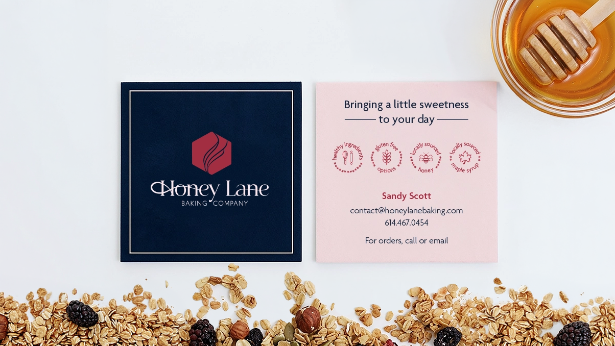
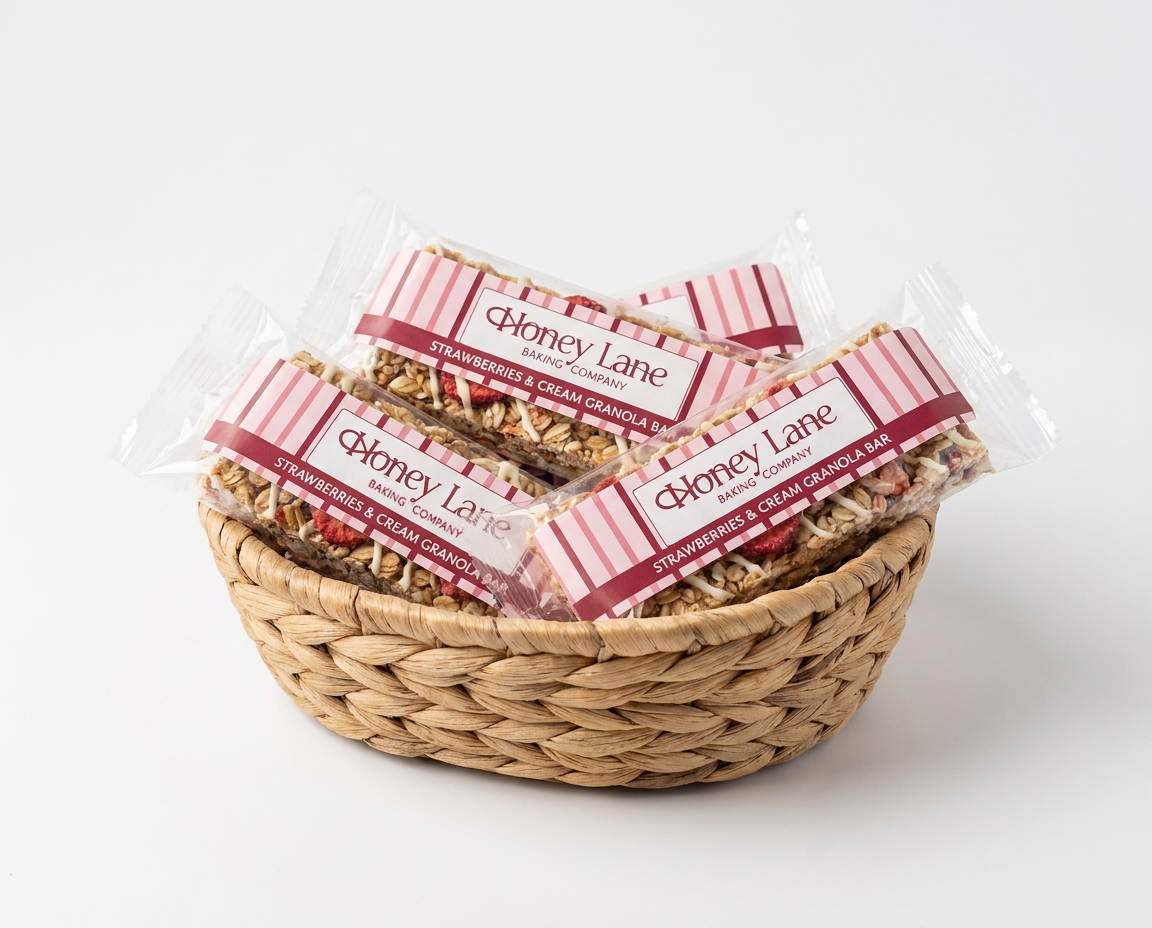
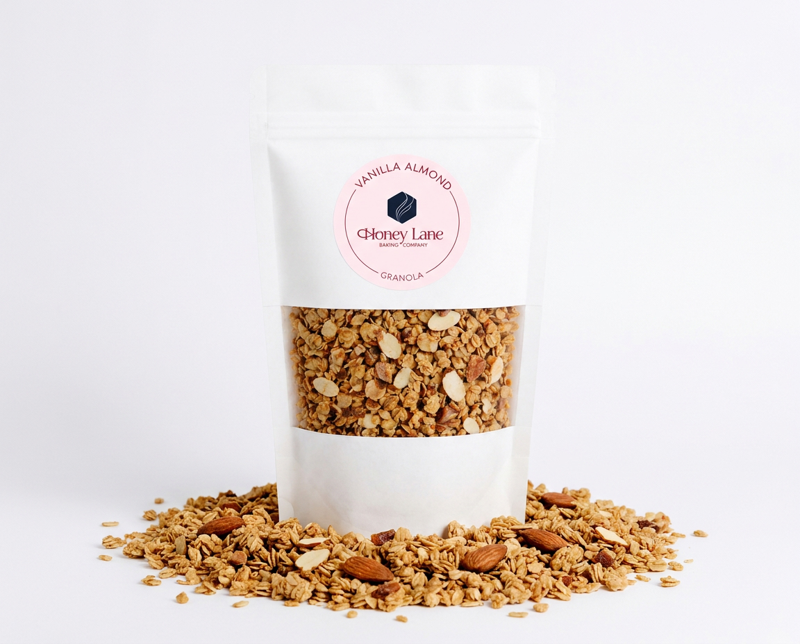
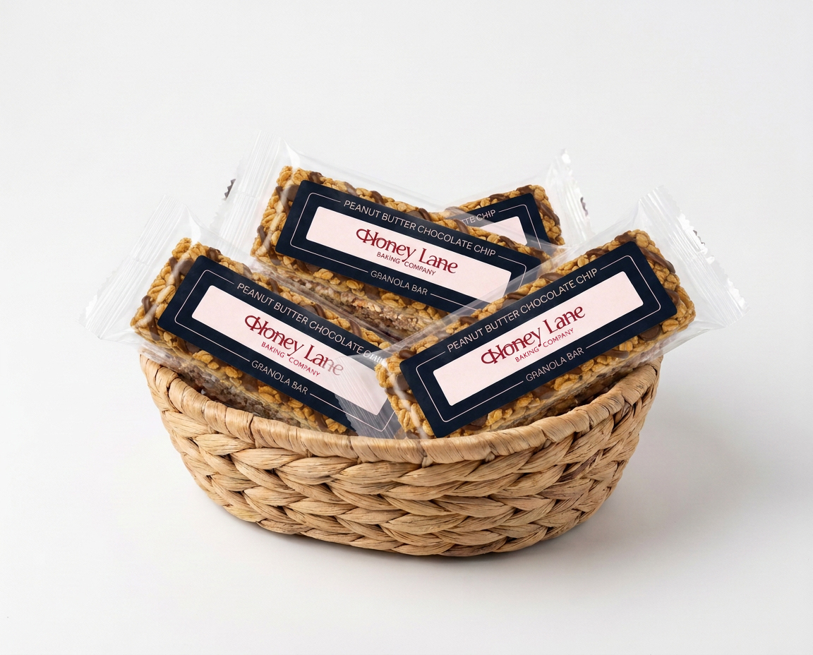
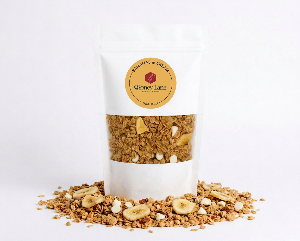
Honey Lane Baking Company is a startup bakery brand specializing in granola made with clean, wholesome ingredients. This project focused on developing a visual identity that feels premium and refined, with a subtle touch of vintage charm. I also helped conceptualize the brand name, connecting the owner’s dog, Honey, with the pure honey used in many of her recipes. “Lane” evokes a stroll through a sweet, charming town, giving the name a warm and inviting feel.
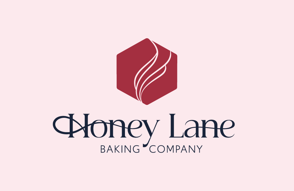
These ideas carried into the logo, where the honeycomb shape subtly resembles a dog tag, tying the personal story to the bakery’s ingredients. After exploring a more intricate whisk-inspired concept, I simplified the design into organic, wavy lines that evoke the warmth of freshly baked goods while keeping the mark clean and cohesive.
Typography further reinforces the brand’s personality. I customized a serif typeface to echo the organic lines within the honeycomb and paired it with a clean, complementary sans serif font. Together, the typefaces balance vintage charm and elegance with a sense of simplicity, reflecting the owner’s commitment to clean ingredients. The result is a visual identity that feels refined yet wholesome, much like the ingredients that go into her baked goods.